
When Cash Jones was ready to launch ChaChing, we knew a merch drop alone wasn't enough. It needed a moment. So we paired it with an EP.
Cash came to us with a concept and a name. We built the brand identity from scratch. The ChaChing logotype is a 3D, hand-drawn graffiti mark in black and yellow, with five white accent stars set inside a vibrant orange circle with black trim. The slightly uneven linework was intentional. It needed grit. The visual direction pulled from a retro '70s aesthetic tied to his earlier project, Skinny Pimp Cash. Nostalgia with a modern edge. His tagline, "ChaChing, it's money," anchored the identity and the campaign.
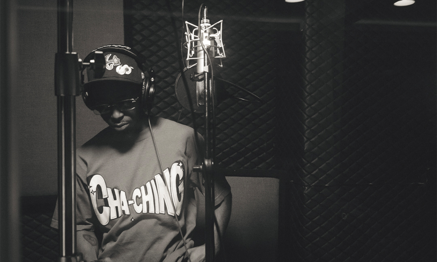
For photography, we kept it tight. Orange backdrop to match the logomark. A money counter to reinforce the concept. Black-and-white studio shots for contrast. Everything was shot in-house, photo and video, to keep the vision consistent from identity through content.
We presented the full package: brand, photo direction, and content plan. The alignment was immediate. From concept to execution, one thread all the way through.


